
Right to
Food Zine
design and art direction
other designers’ contributions are credited directly next to their work
Right to Food Zine is an independent media source that provides valuable information on the human right to food, and strives to be a place for community building in Vancouver’s DTES.
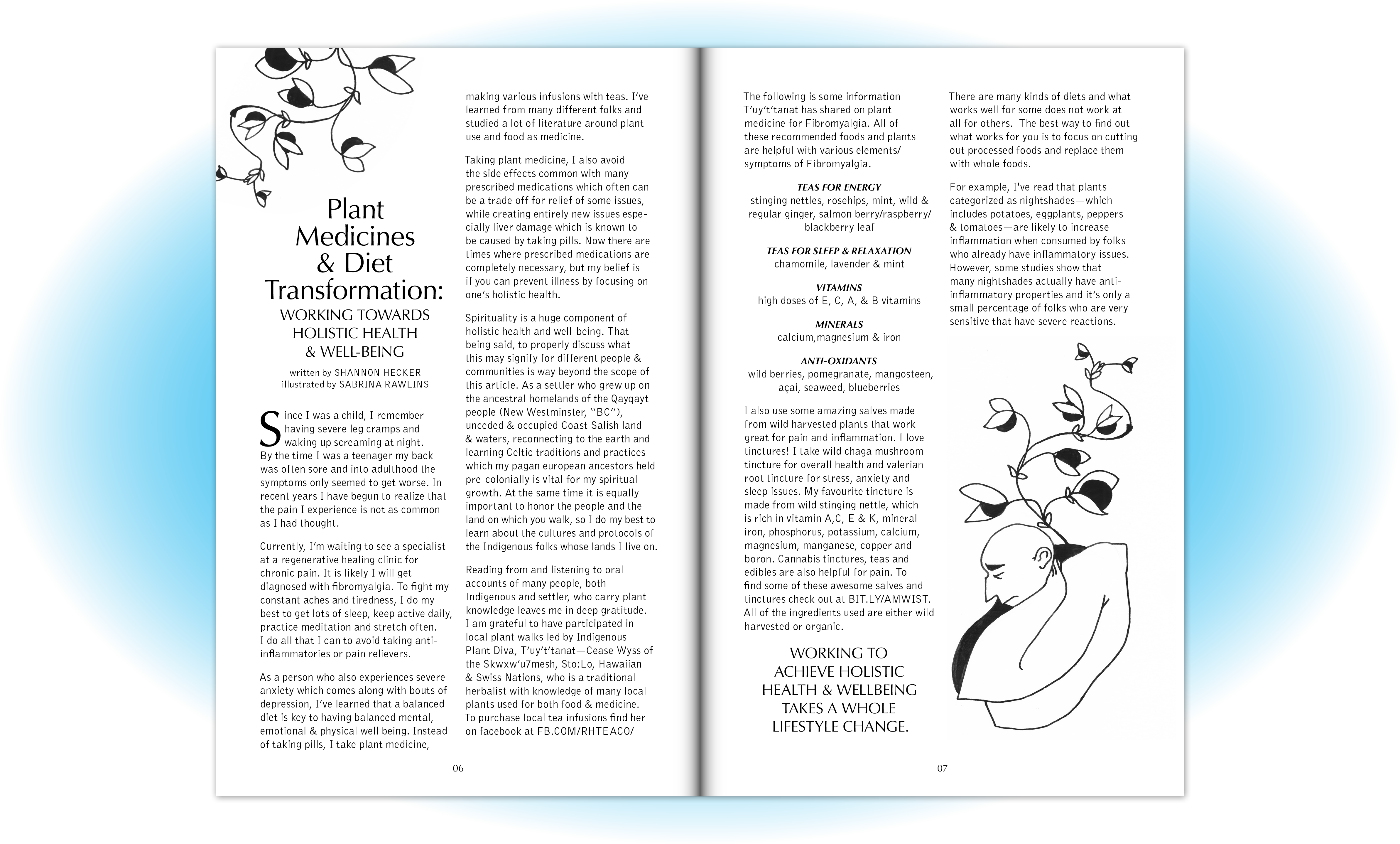
My goal when designing this zine, was to mix in some DIY aesthetics (without compromising readability) and make it fun to flip through!


l
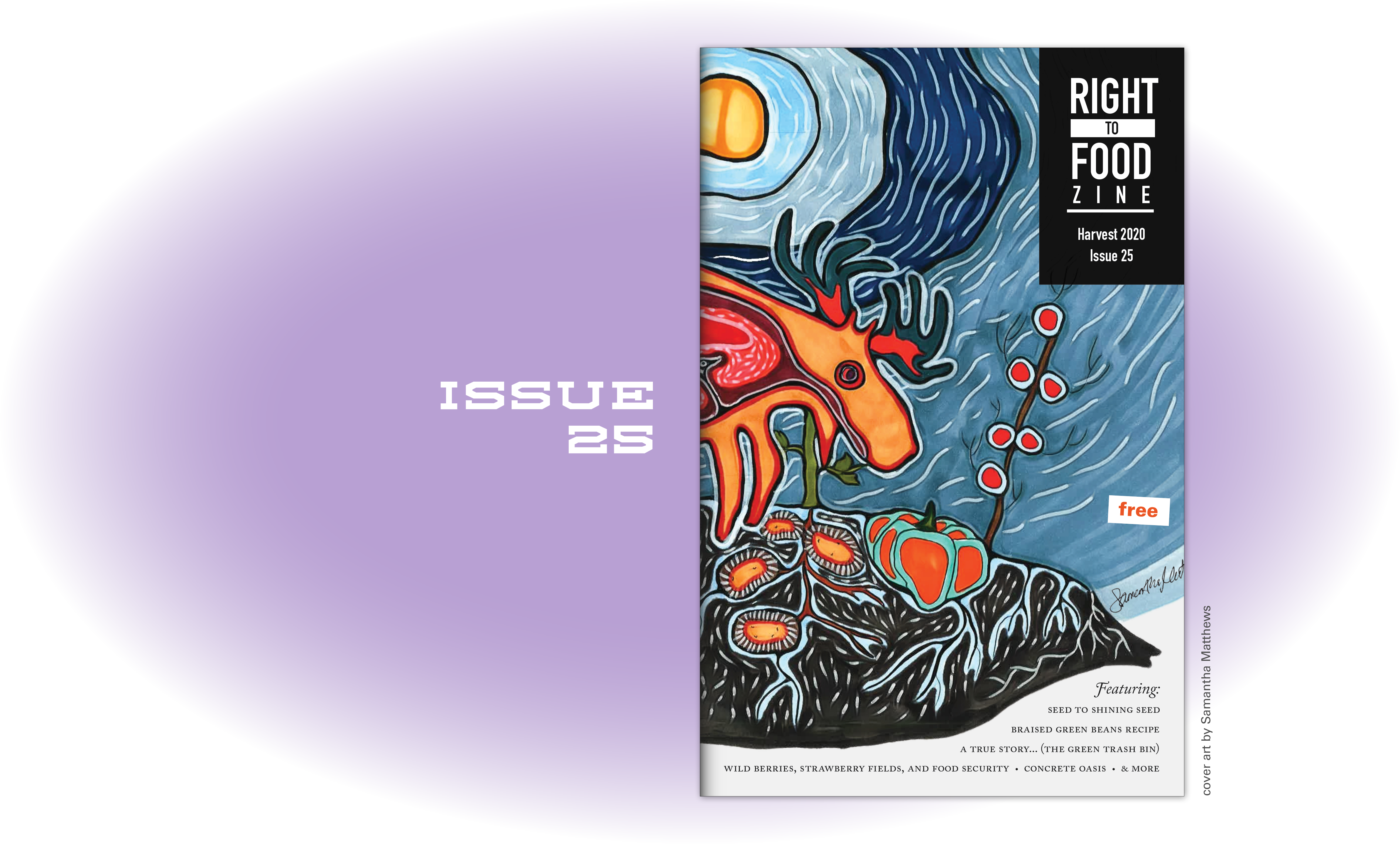
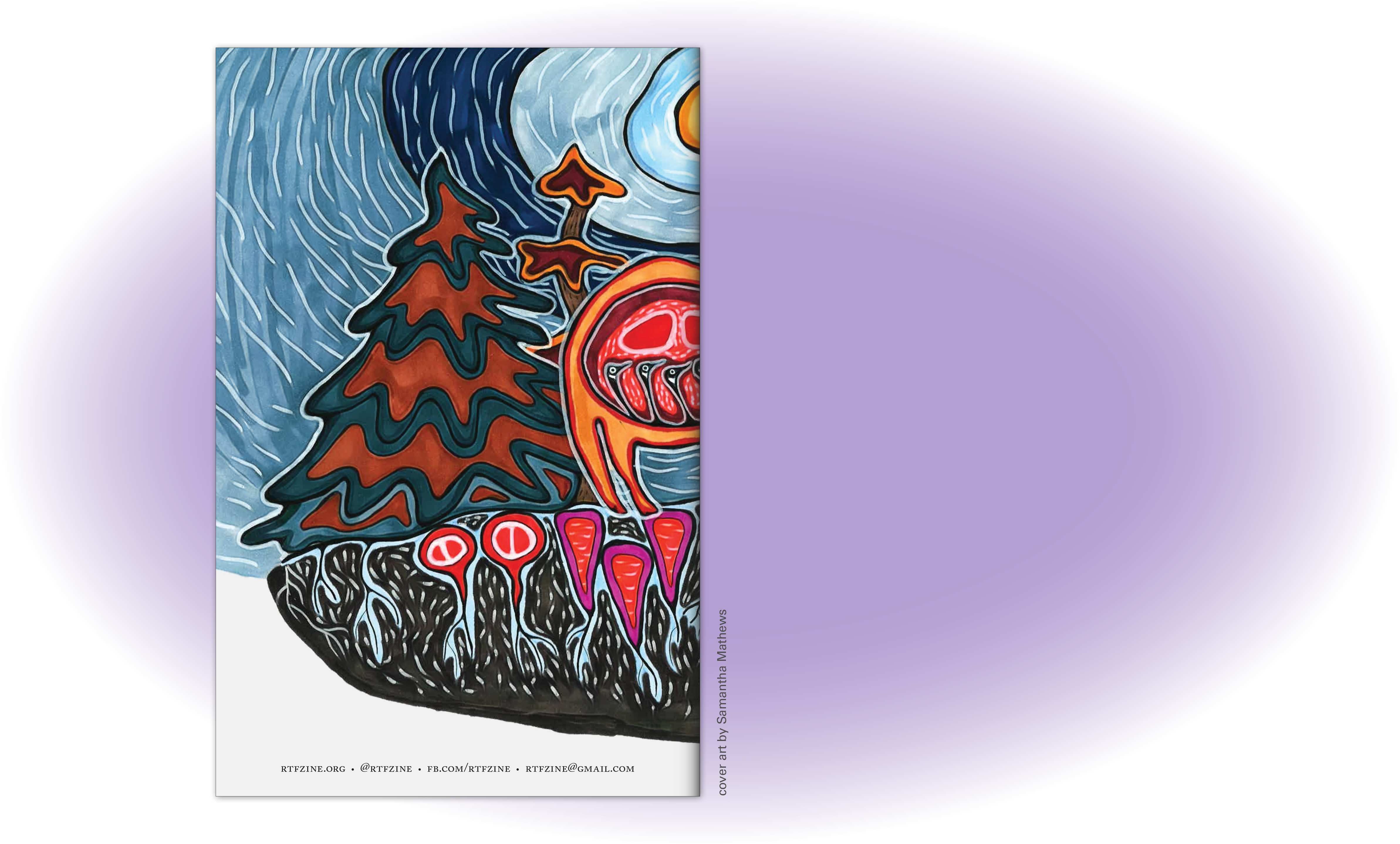
Samantha Matthews created some beautiful, vibrant artwork for the cover. As it spans the front and back, we get to enjoy seeing all the detail and trace of the artists hand.
Issue 25: final thoughts
This is the last issue of the zine that I worked on as the primary designer. I am proud of this issue, it is my favourite both in content and in design. I used the collage method for stylized callouts that is also utilized in Issue 23. Along with the hand drawn cover art, the texture of the scanned pieces of paper reflects the physical, in-person experiences of our past zine meetings which have shaped Right to Food Zine in a significant way.
This is the last issue of the zine that I worked on as the primary designer. I am proud of this issue, it is my favourite both in content and in design. I used the collage method for stylized callouts that is also utilized in Issue 23. Along with the hand drawn cover art, the texture of the scanned pieces of paper reflects the physical, in-person experiences of our past zine meetings which have shaped Right to Food Zine in a significant way.
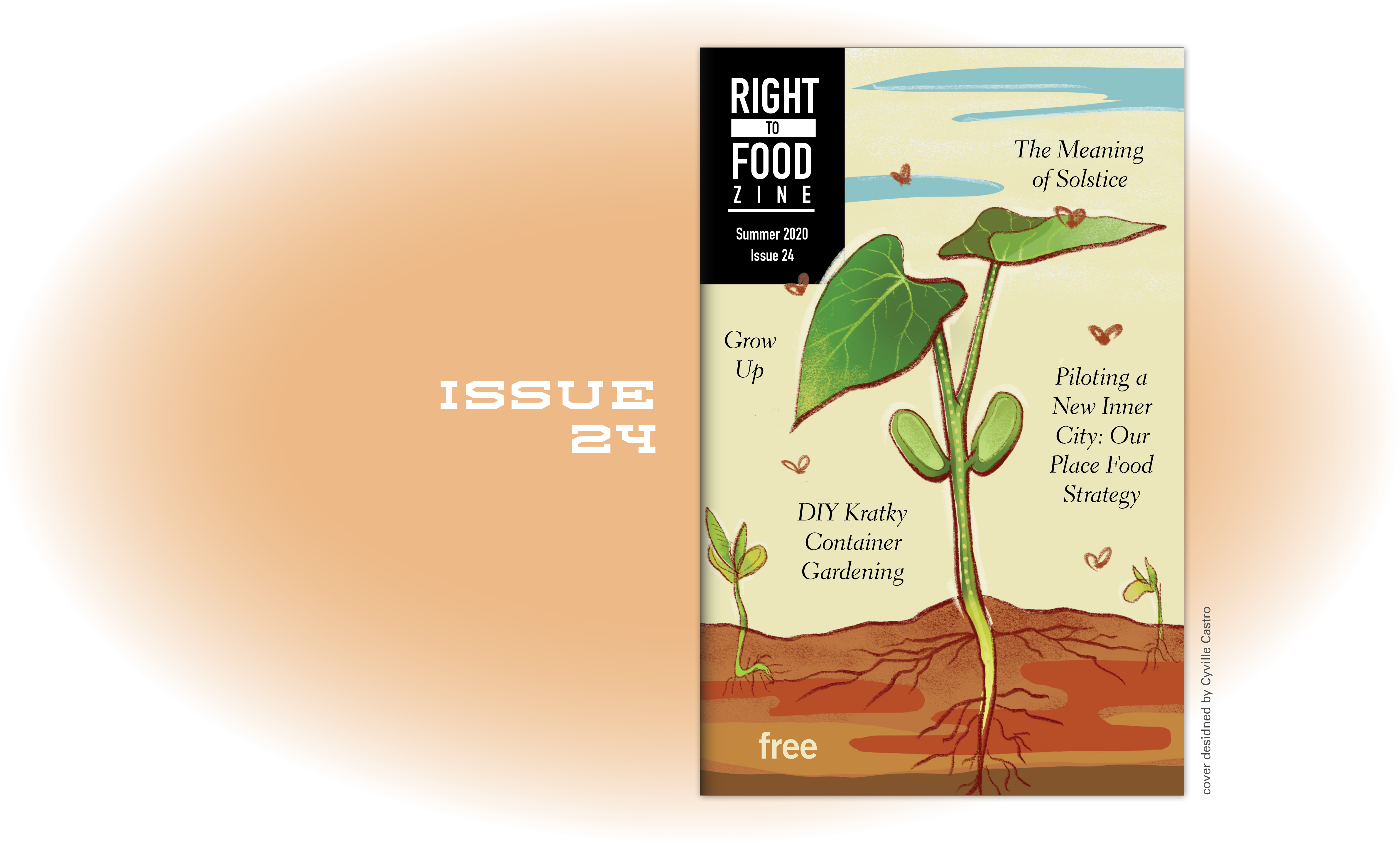


Cyville Castro designed the cover of our summer issue based on ideas generated by community members—new growth was the concept.
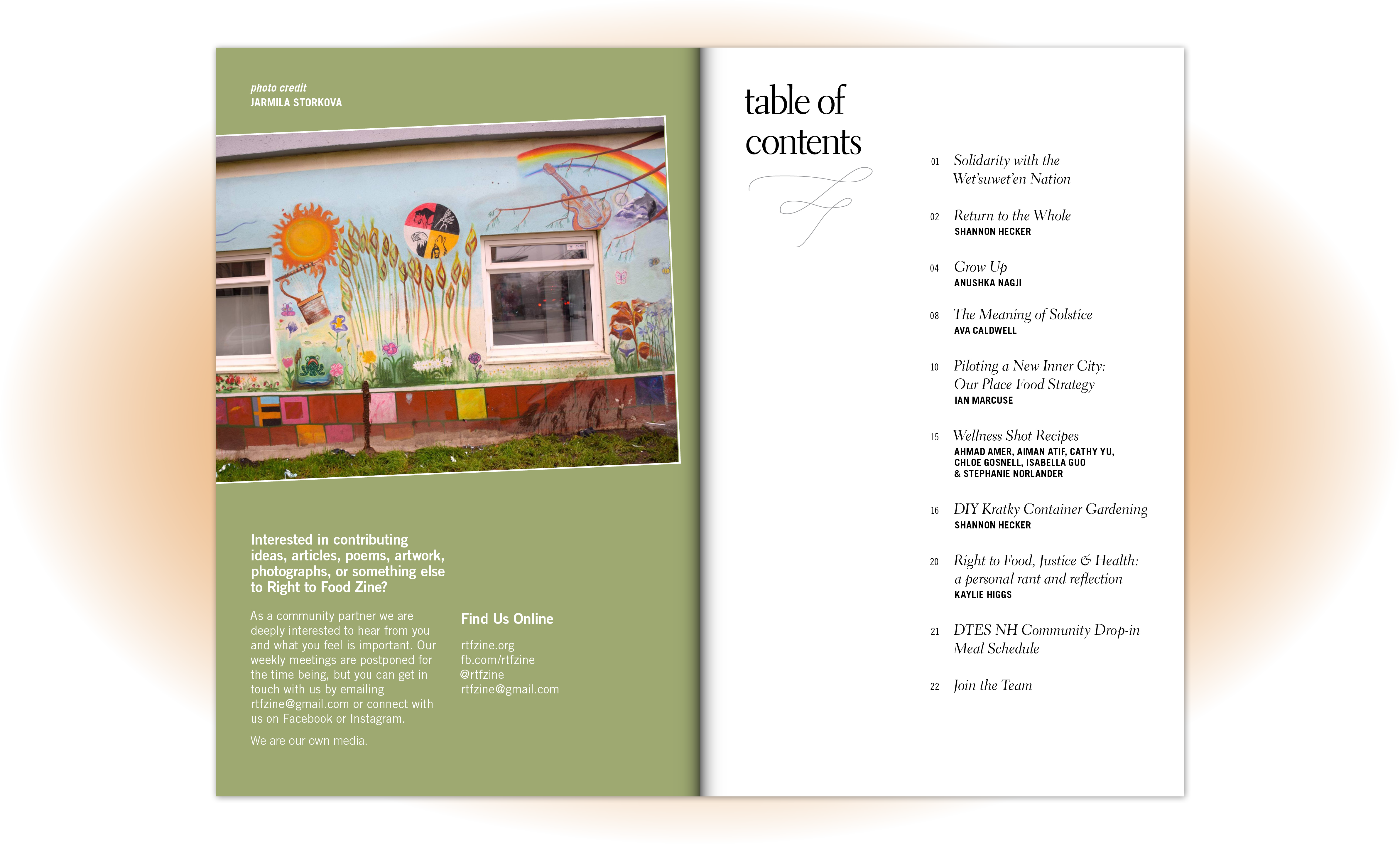
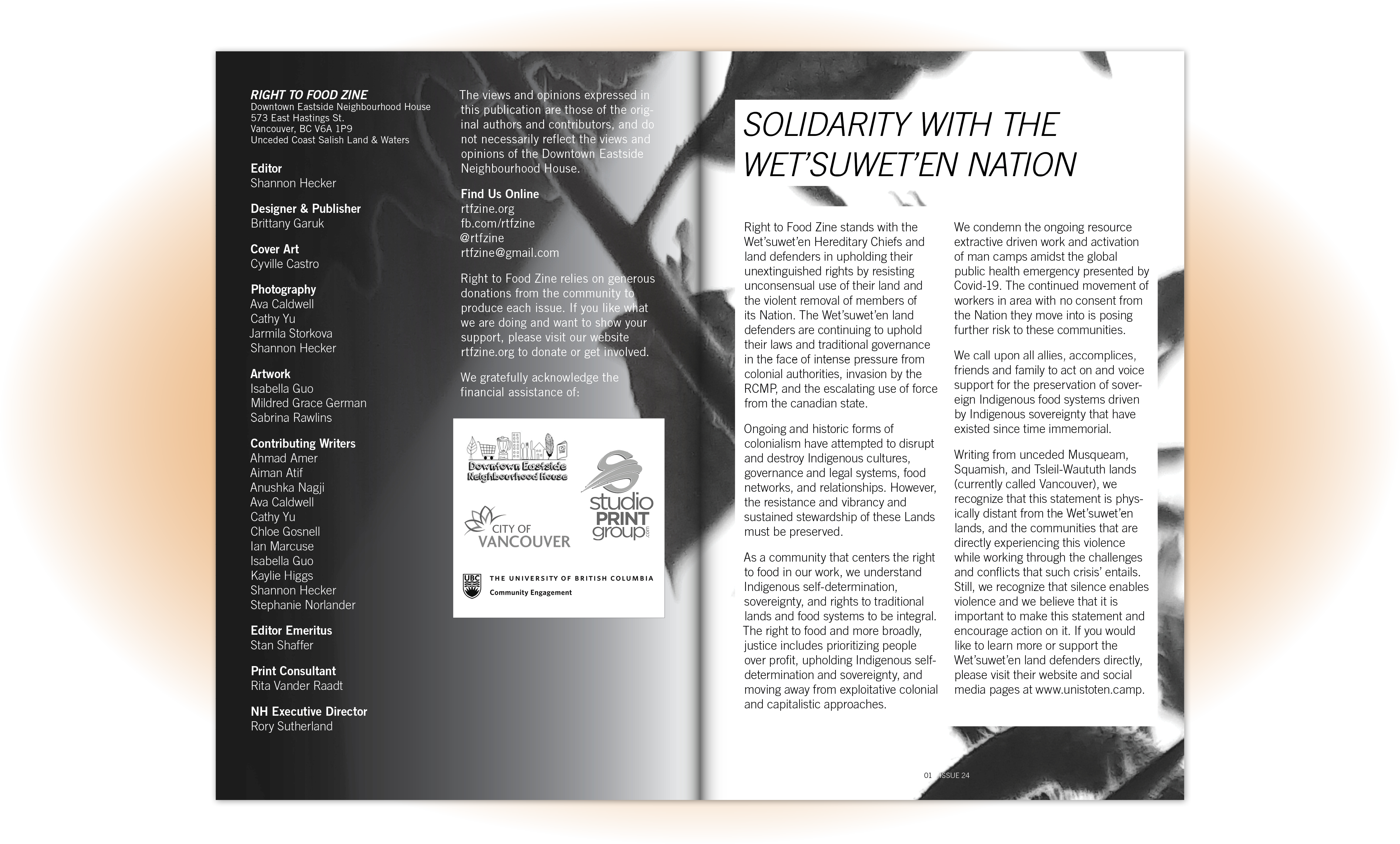
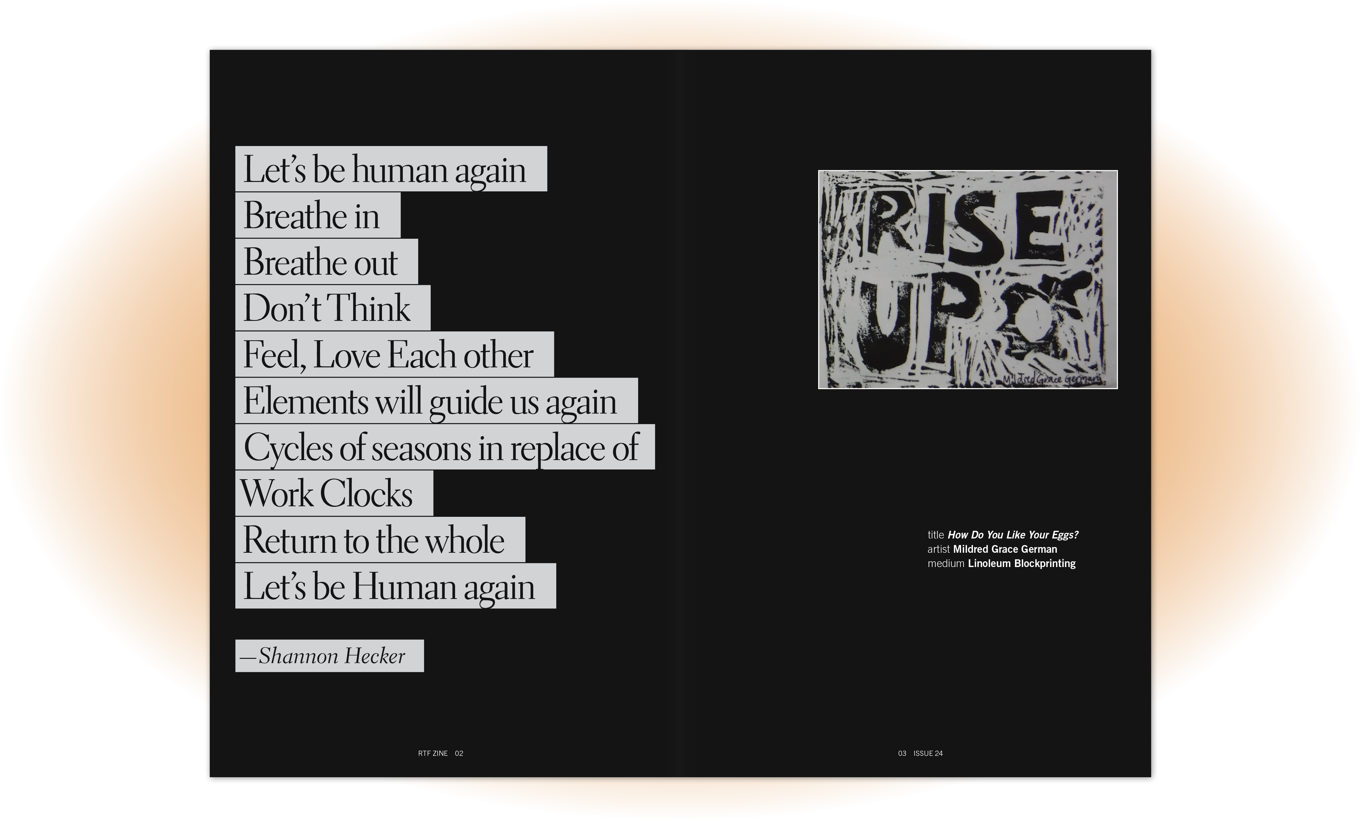
Issue 24: resiliency
This was the most challenging issue for us, as we were working on it when the pandemic hit North America. This time has impacted the way that we think about food, and exemplified the importance of the zine in advocating for food security and sovereignty.
This was the most challenging issue for us, as we were working on it when the pandemic hit North America. This time has impacted the way that we think about food, and exemplified the importance of the zine in advocating for food security and sovereignty.


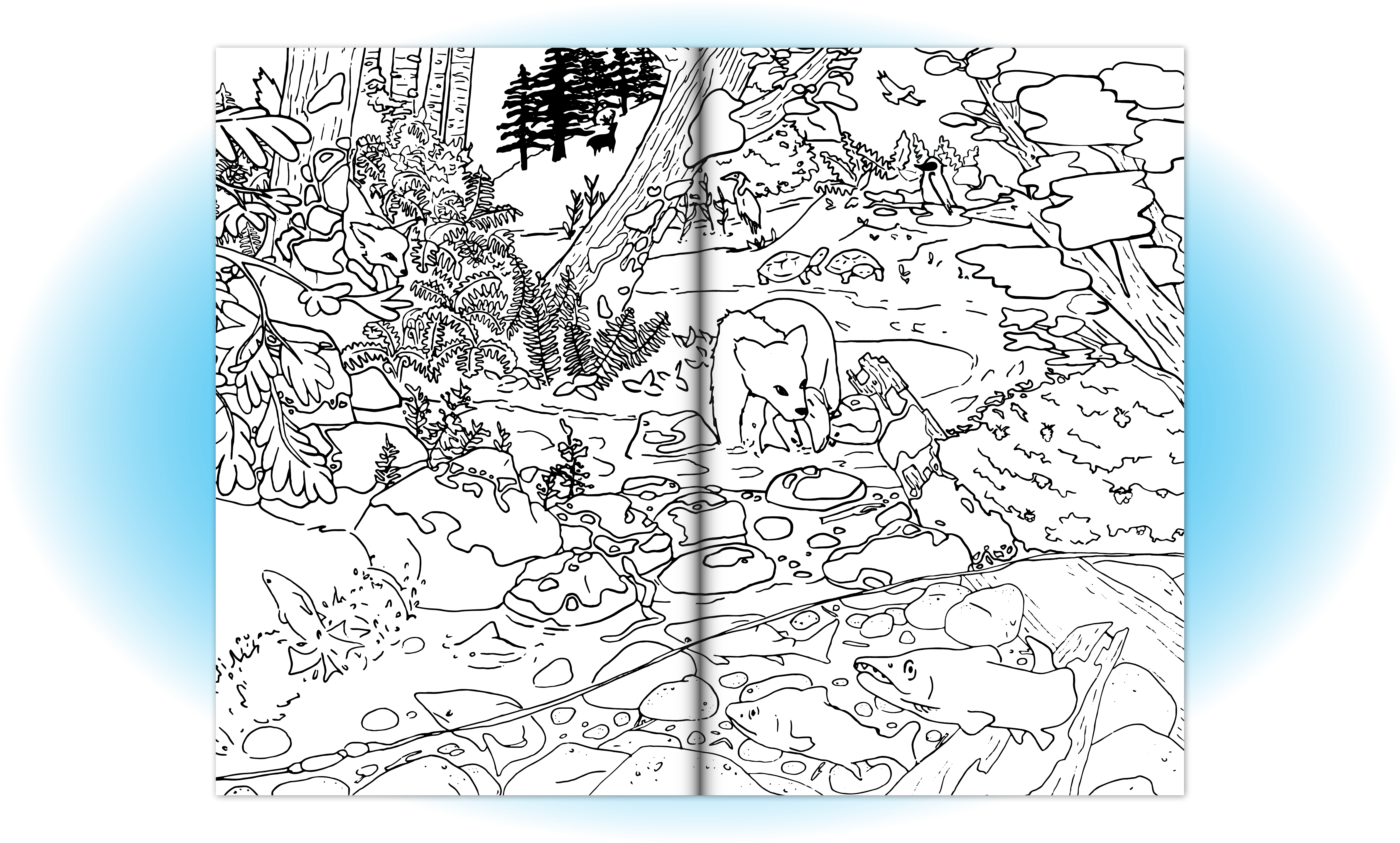


For the cover of this special colouring book edition we wanted to display a selection of coloured-in illustrations that are featured as line drawings inside. To accommodate the variety of styles I created a collage using these illustrations as well as images cut from magazines that relate to food or environment.
Issue 23: the colouring book edition
Inspired from last issue’s cover (which the artist had mentioned wanting to make into a colouring page), we realized our whole zine could easily double as a colouring book. Since the inside of the zine is always printed in black and white, it made a lot of sense! We opted for limited photographs and tasked our illustrators with creating line drawings for each article. This format simply adds another level of engagement and interaction with the zine without sacrificing written content.
For this issue I wanted to experiement with other ways of making the zine read as a grassroots publication. I printed out some text elements of the zine and scanned them to get a DIY photocopied appearance while using friendly and fun typefaces.


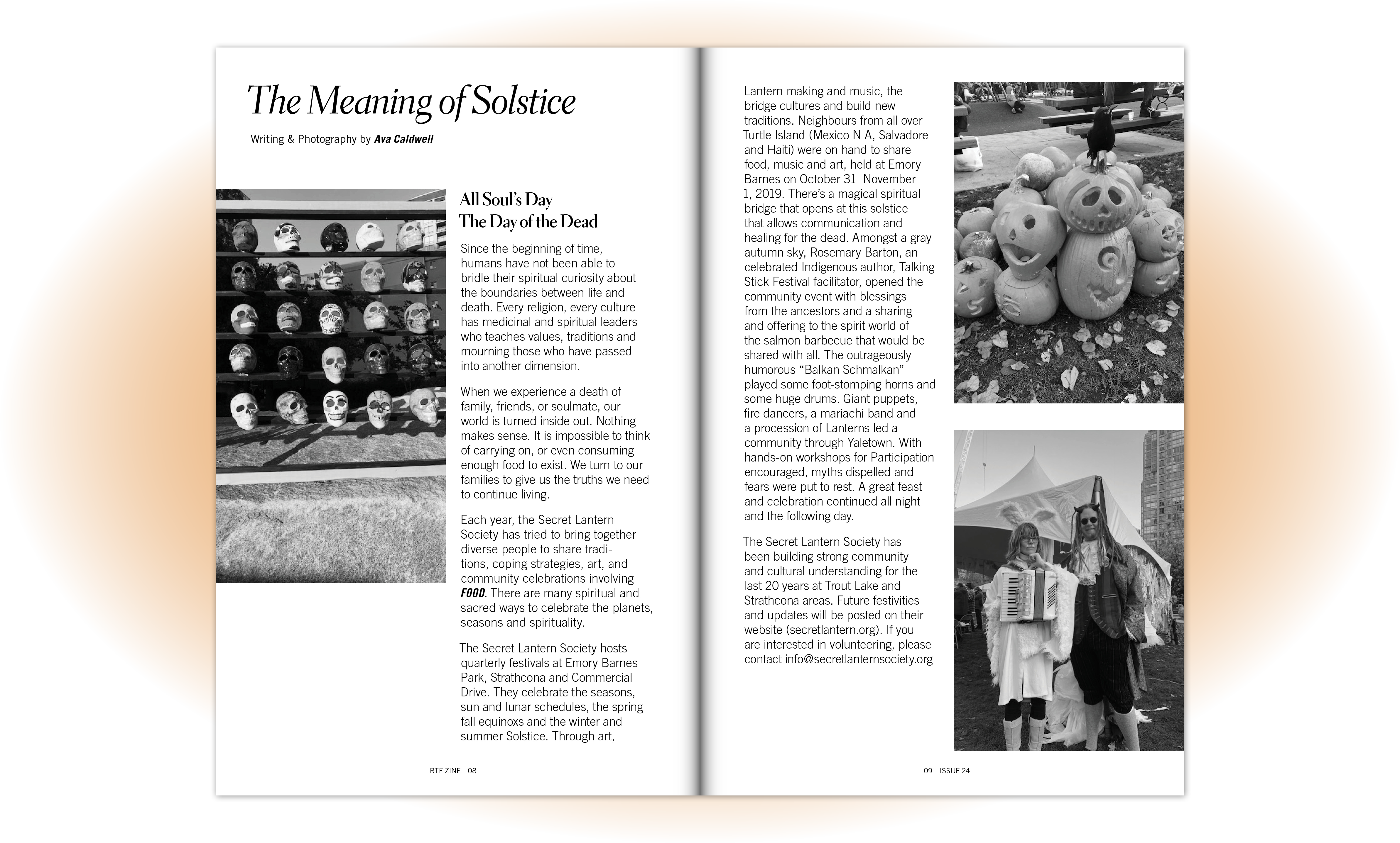
Barbara Reid created a beautiful illustration for the cover of this issue, inspired by conversations at a Zine meeting around the importance of salmon in local ecosystems.
Issue 22: partnering with Sustenance Festival
Working with the Sustenance Festival allowed us to print more copies of this issue and reach a new audience. We were able to promote the zine at the festival and received a ton of positive feedback from attendees. Based on feedback that Issue 21 looked too polished, we decided to allow for more experimentation going forward. I chose to concentrate a little bit less on uniformity for this issue, played with different layouts, and experimented with typesetting and pairing.
Working with the Sustenance Festival allowed us to print more copies of this issue and reach a new audience. We were able to promote the zine at the festival and received a ton of positive feedback from attendees. Based on feedback that Issue 21 looked too polished, we decided to allow for more experimentation going forward. I chose to concentrate a little bit less on uniformity for this issue, played with different layouts, and experimented with typesetting and pairing.


With the DTES NH community garden thriving, we wanted to feature it on the cover. As this was our Spring/Summer issue we took full advantage of the cover being printed in colour, using bright colours and highly saturated photos to give it a lively appearance.
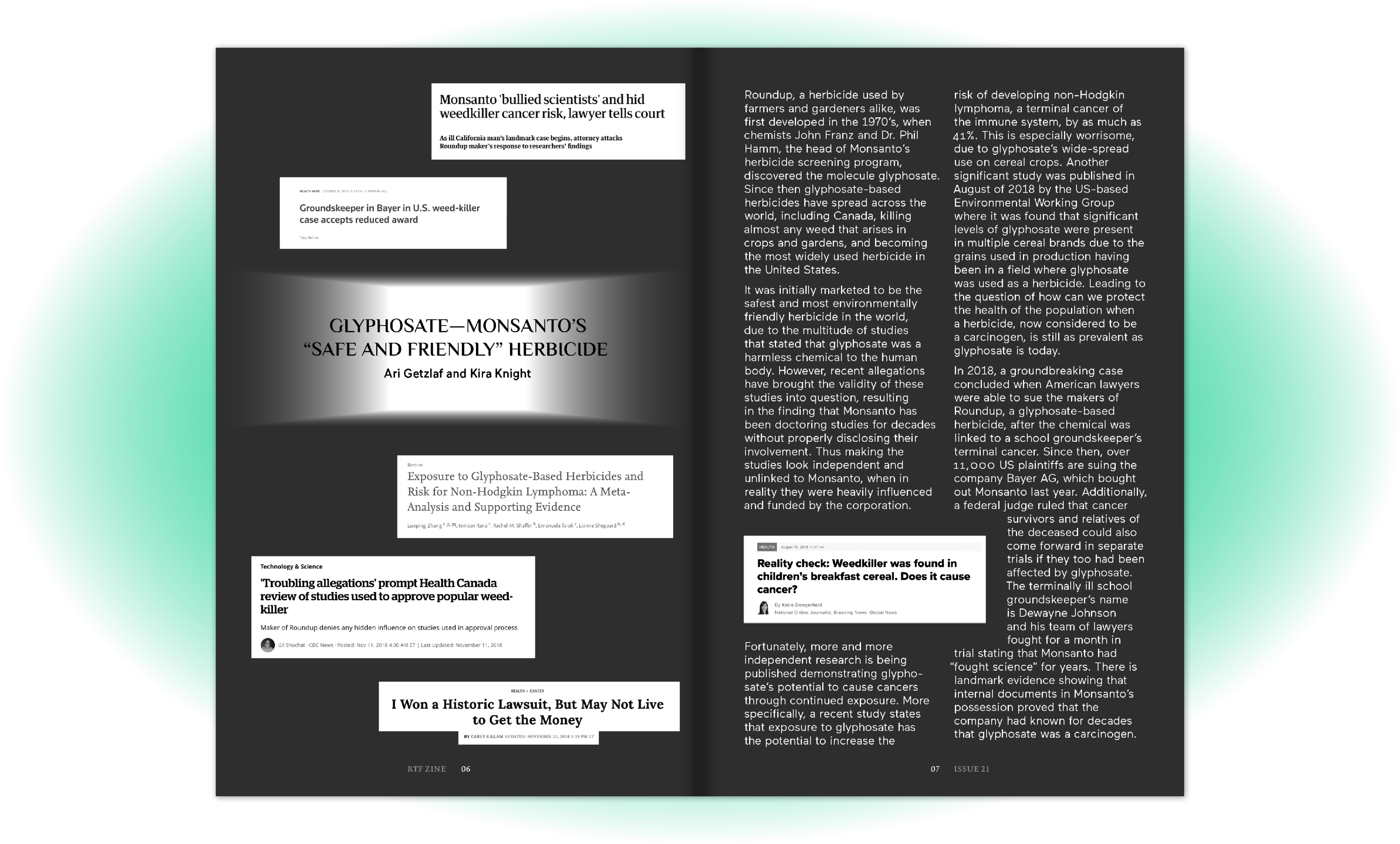
Issue 21: my first time designing the zine
When I joined the team I knew I wanted to take the design of the zine in a different direction. Communication throughout the the making of this issue was essential, as it was important to ensure the team was not just comfortable with the new approach, but actually supported it. Since the release of this issue, our determination to design the zine with these new intentions has been fully embraced by the team and our readers.
Since our submissions for this issue were much shorter than usual, I was able to give each piece more room in the zine than what was standard in past issues. This allowed me to highlight pullquotes and have ample space to place images complimentary to the writing, while giving the content room to breathe.