


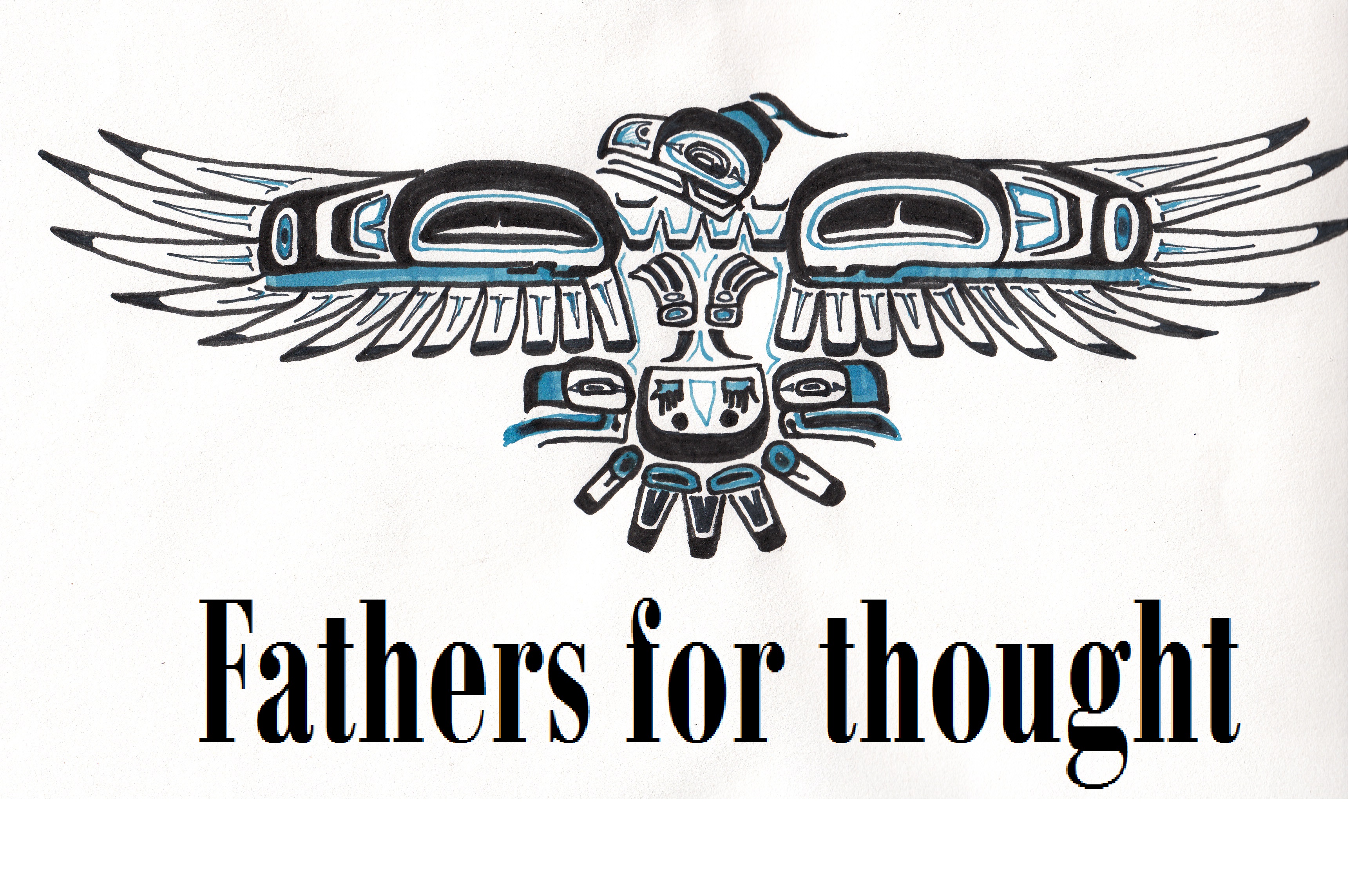
Fathers for Thought
Overdose Prevention Project
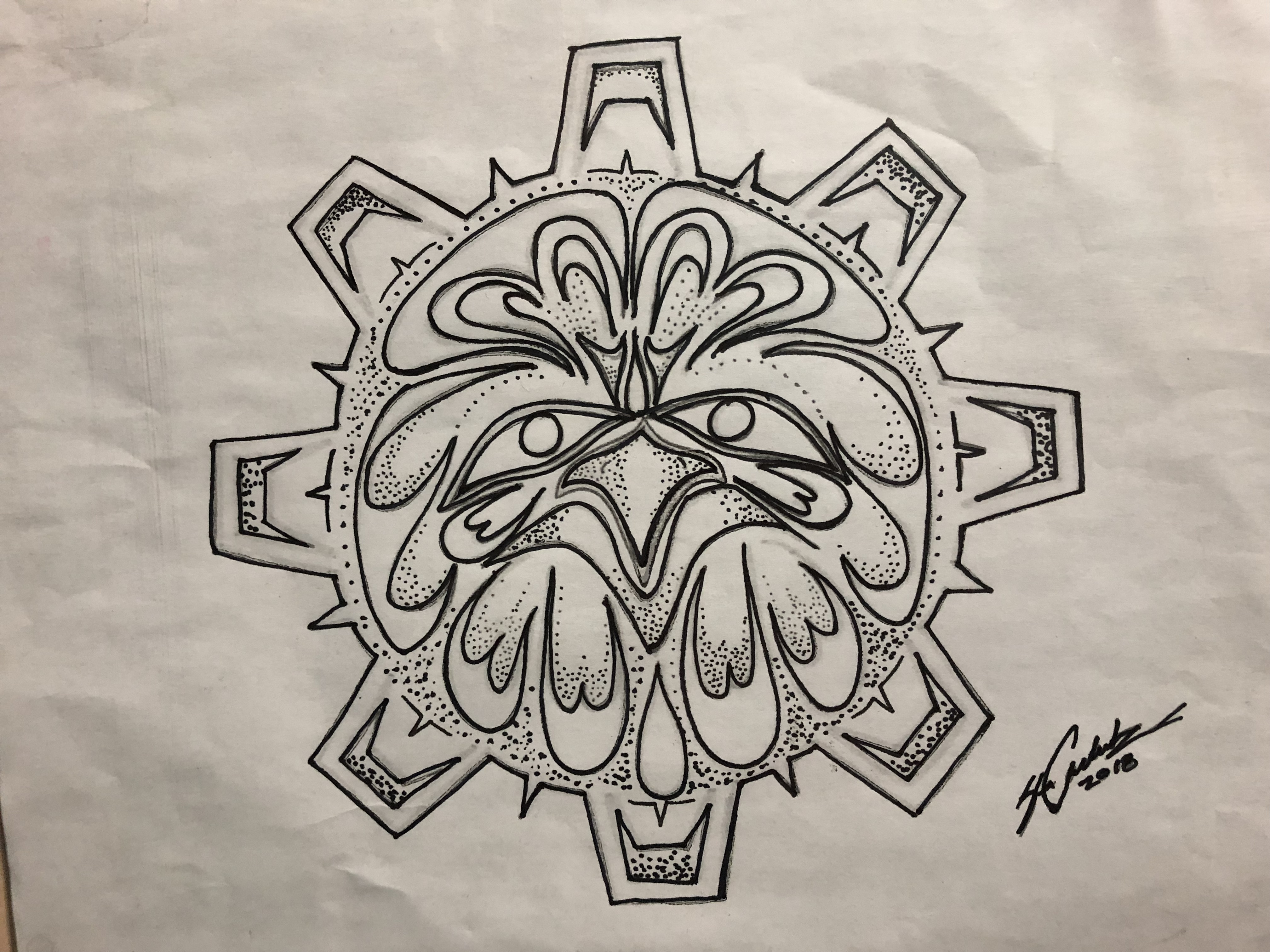
identity and outreach materials designed by Brittany Garuk
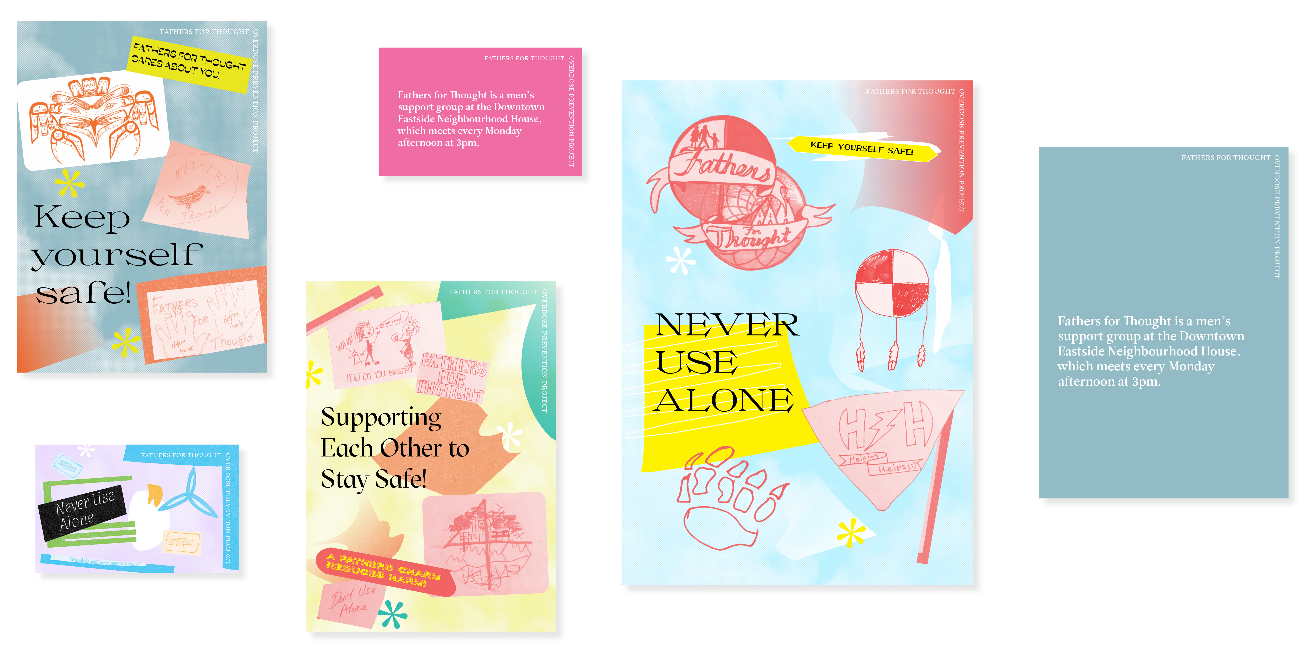
Fathers for Thought is a men’s support group at the Downtown Eastside Neighbourhood House. Their Overdose Prevention Project primarily serves to reach people in the DTES with positive messages from the group, with the goal of harm reduction.
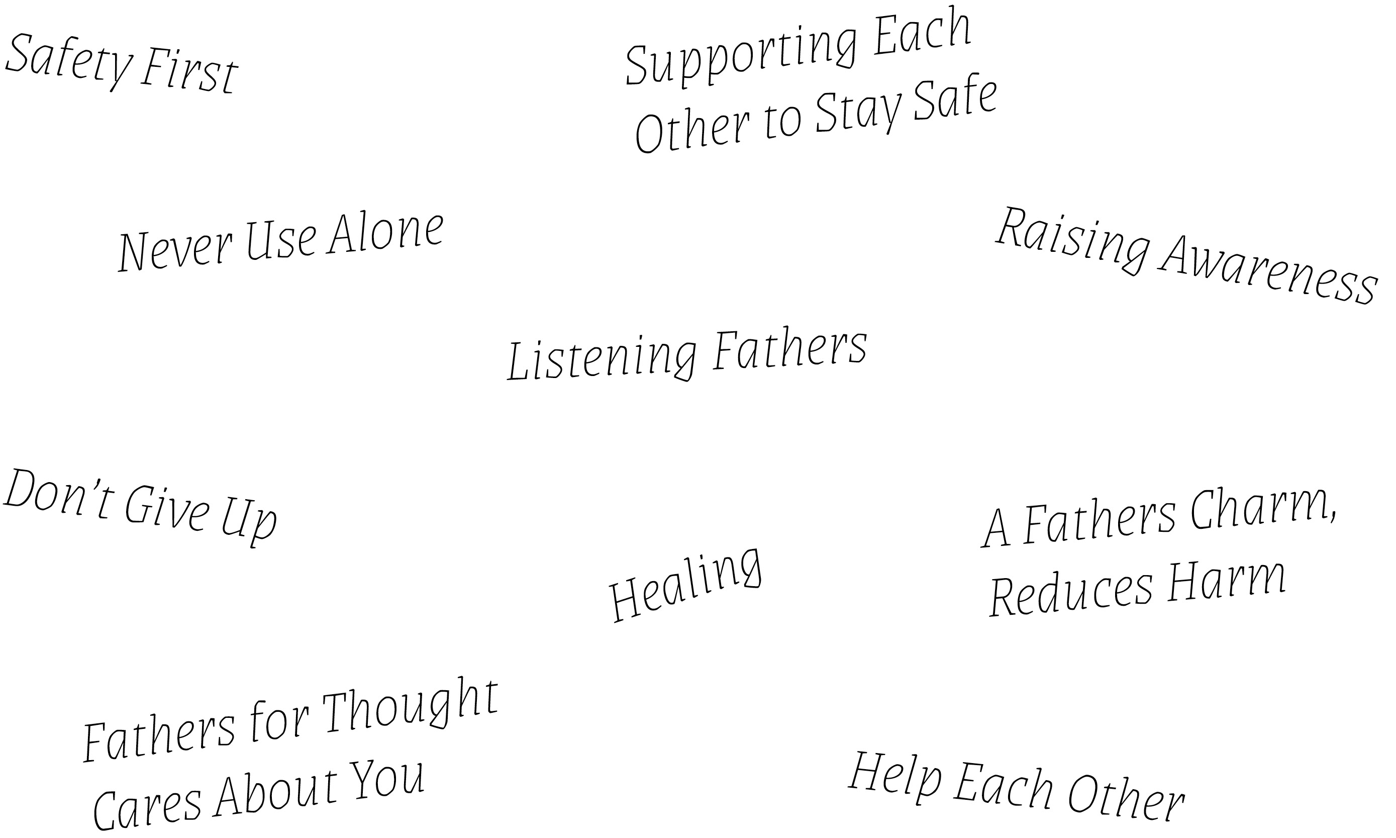
some of the messages that the group brainstormed
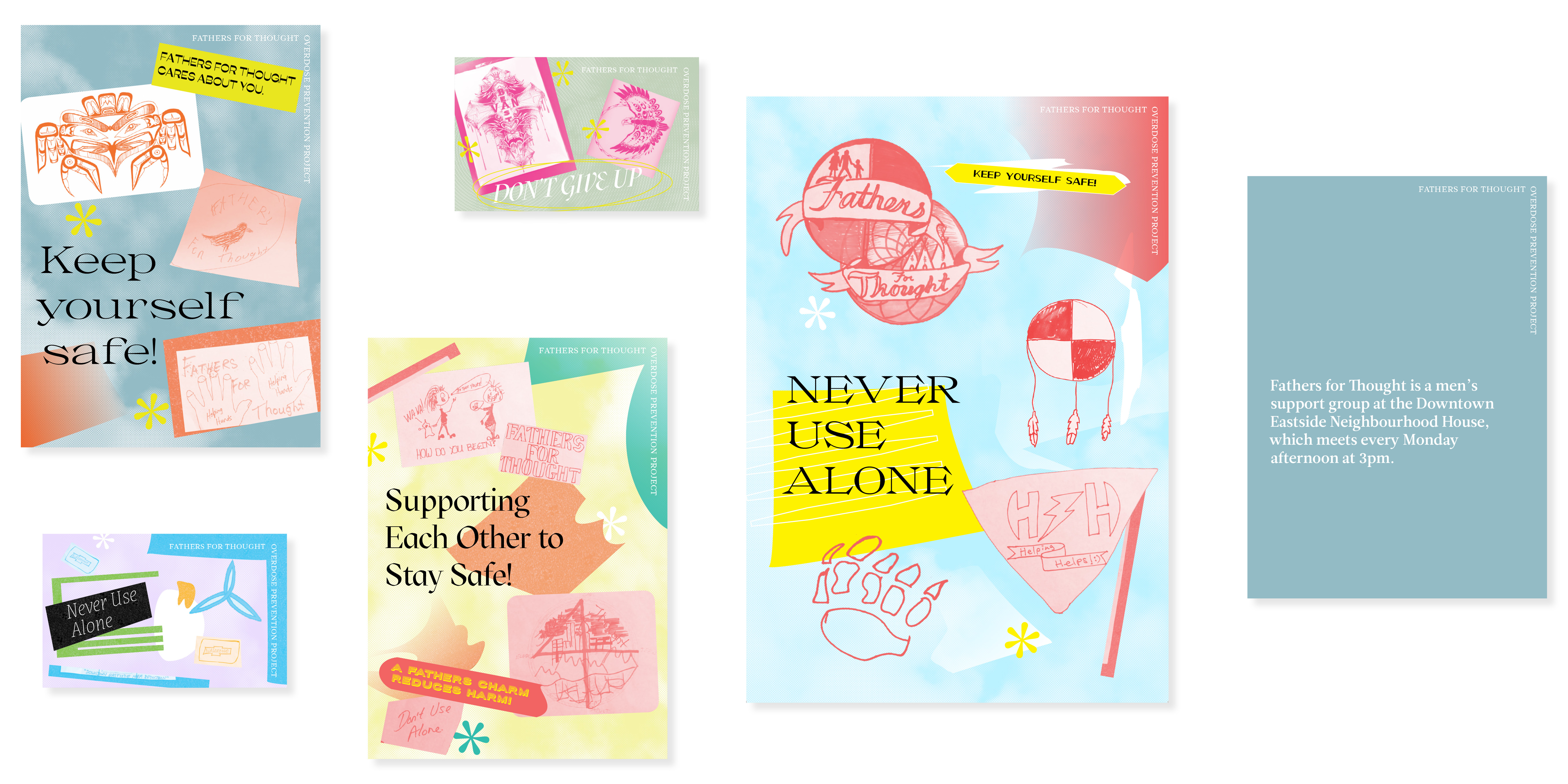
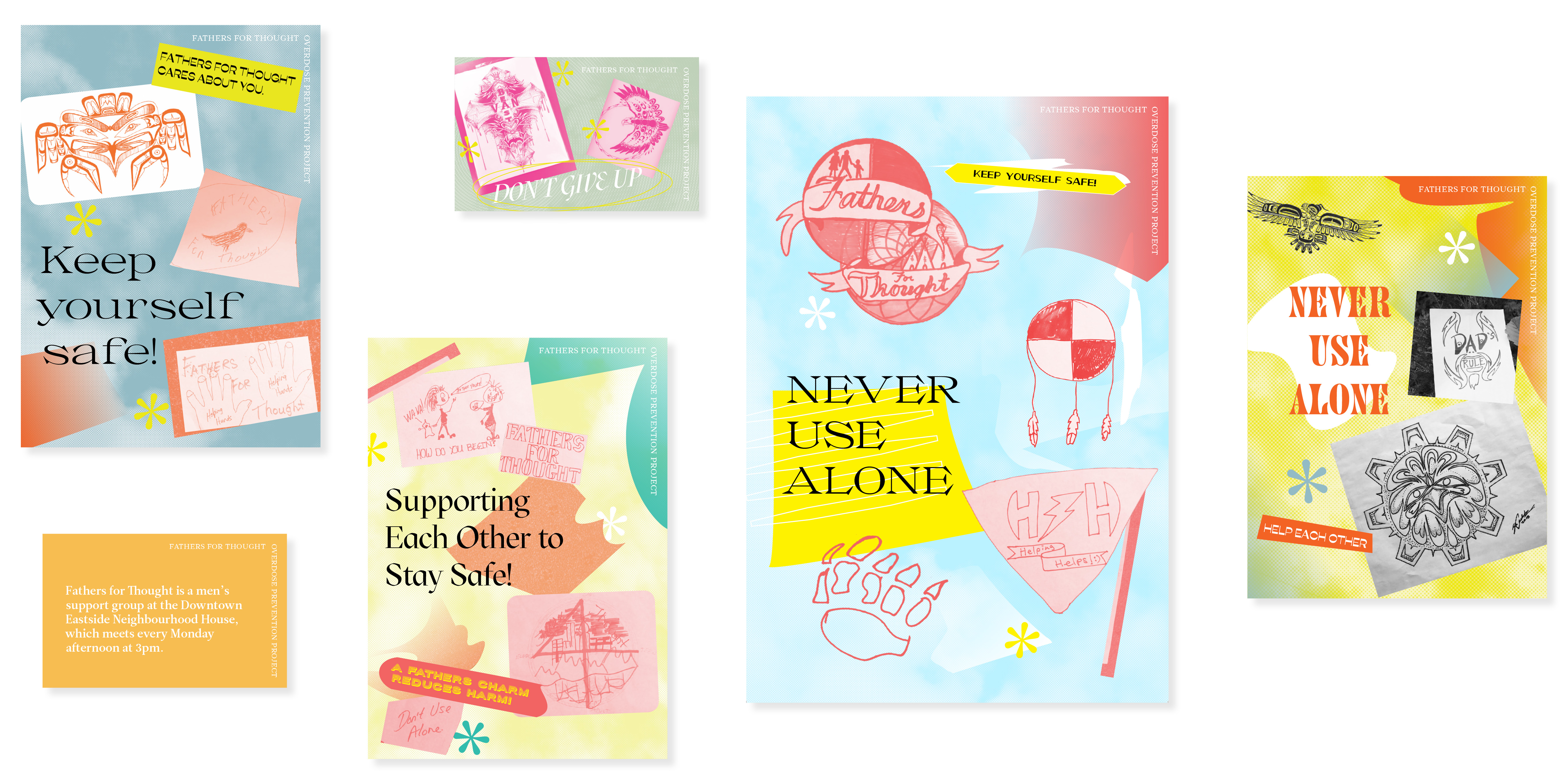
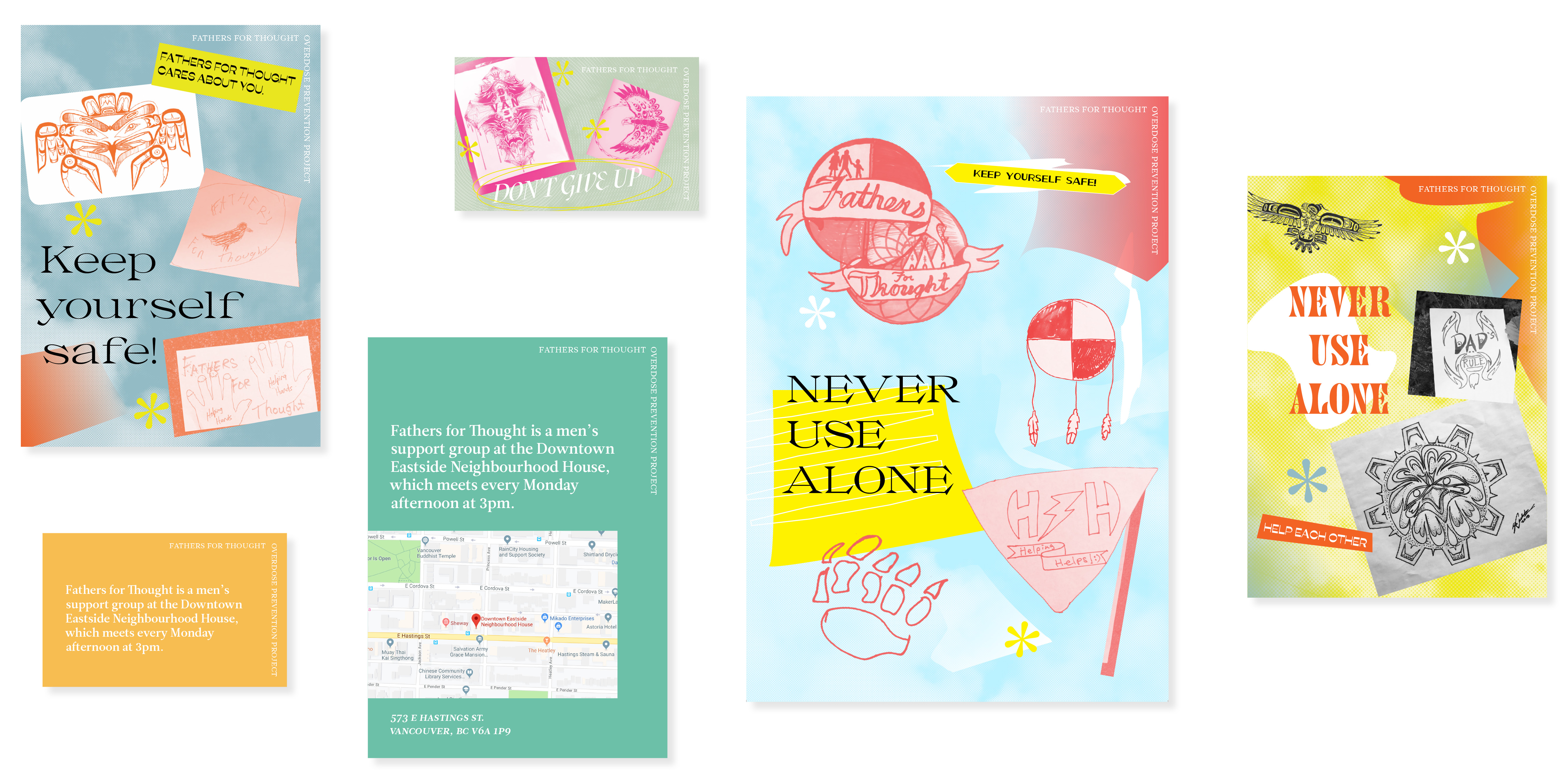
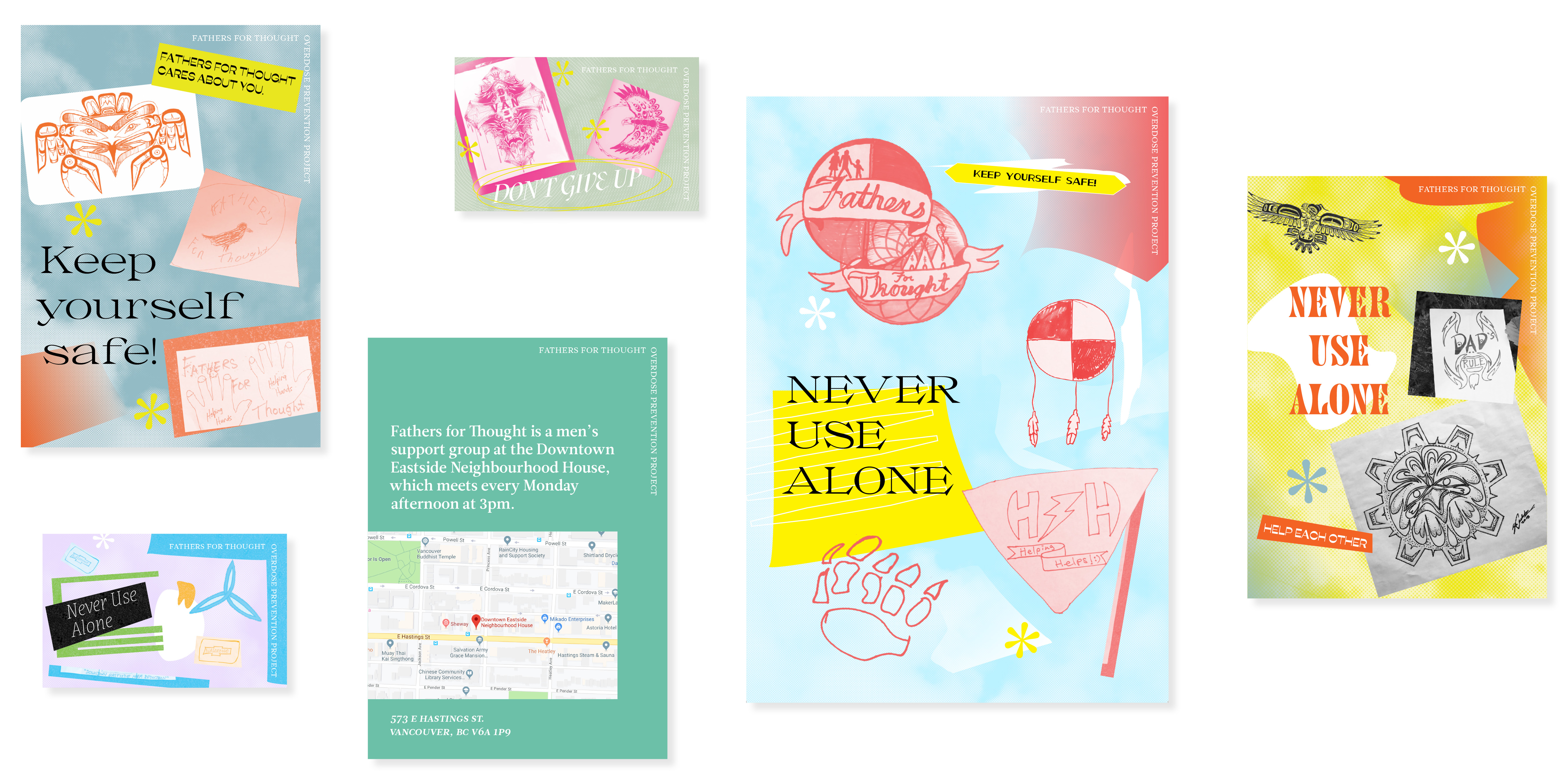
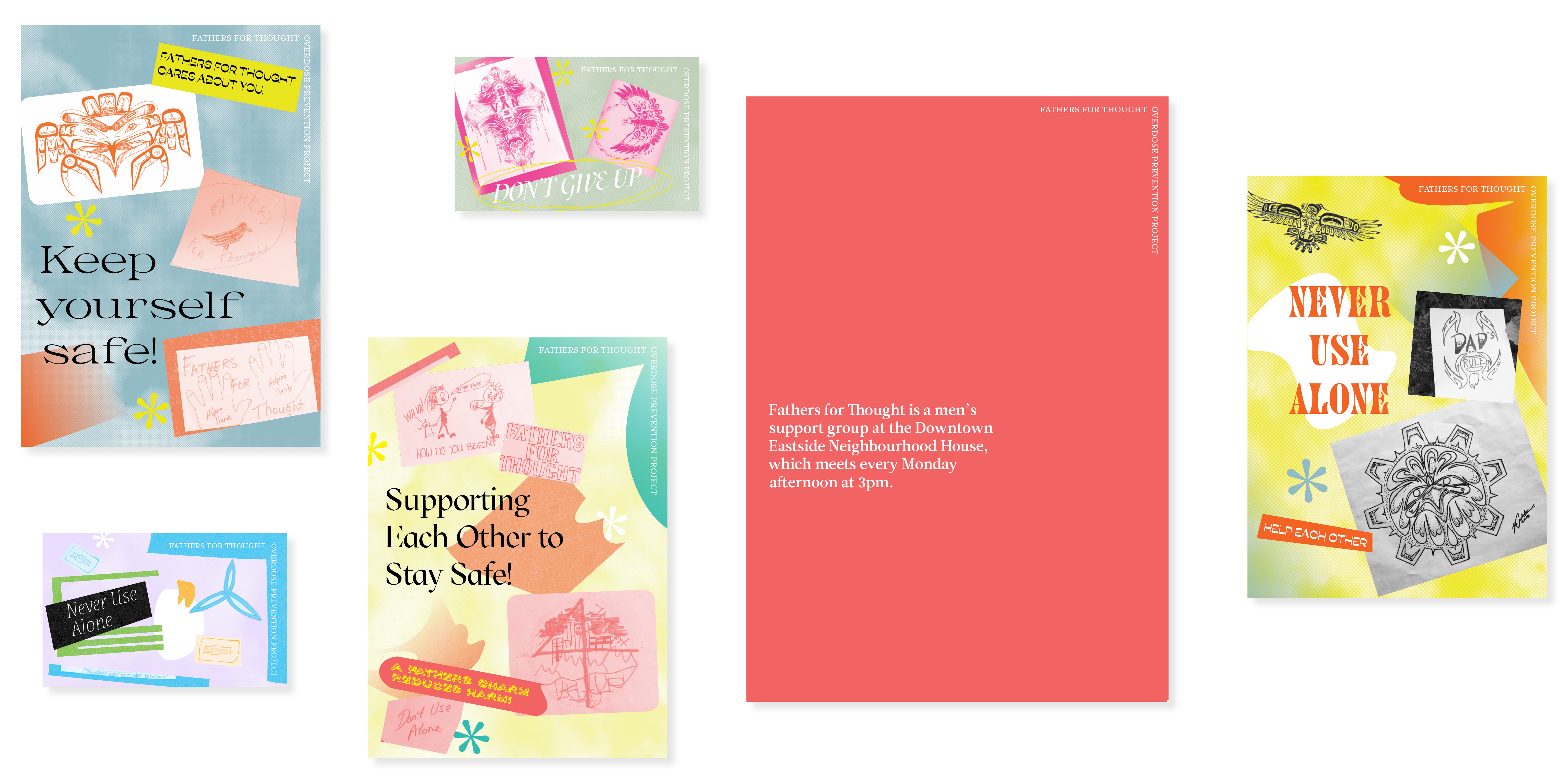
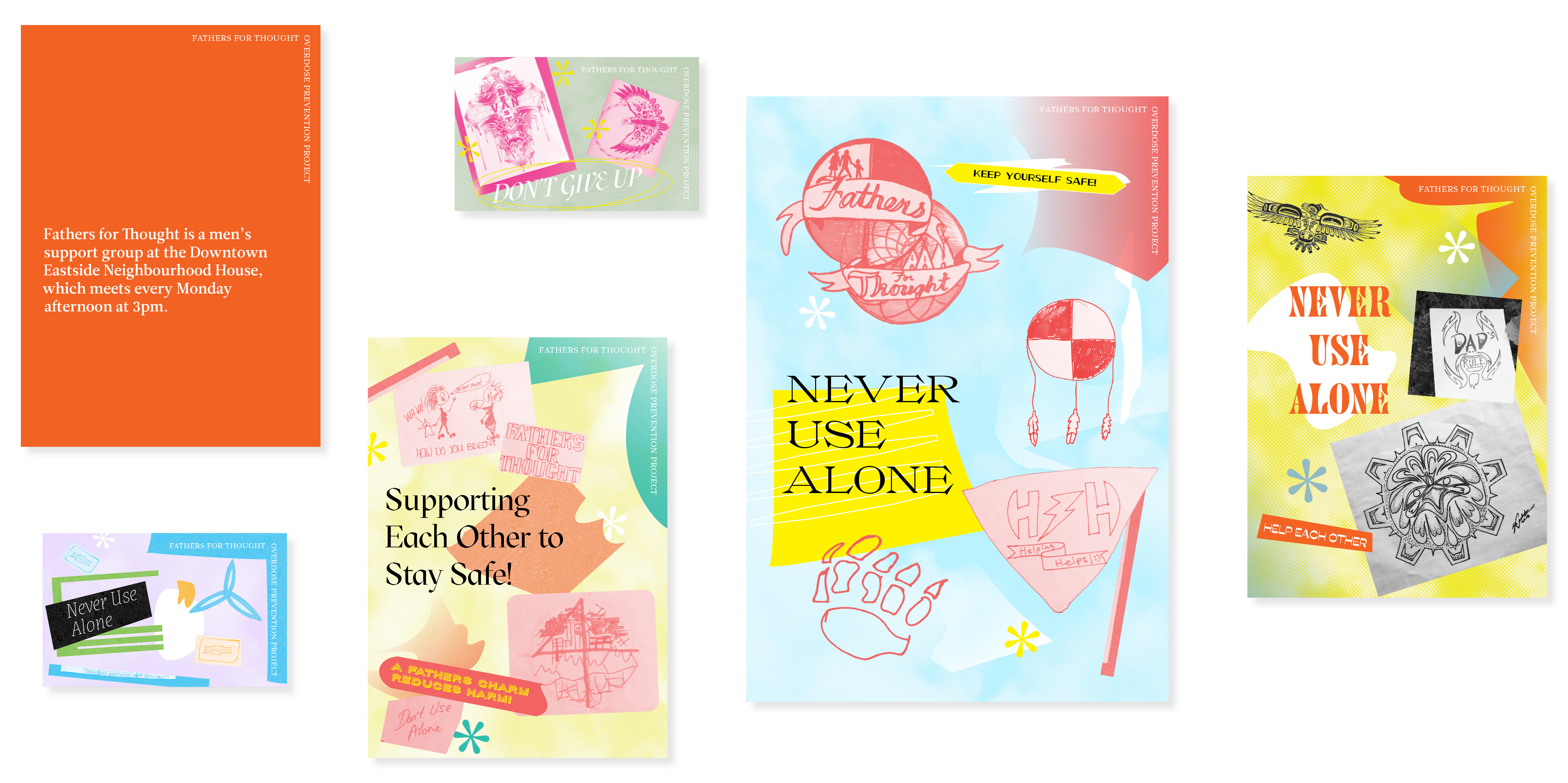
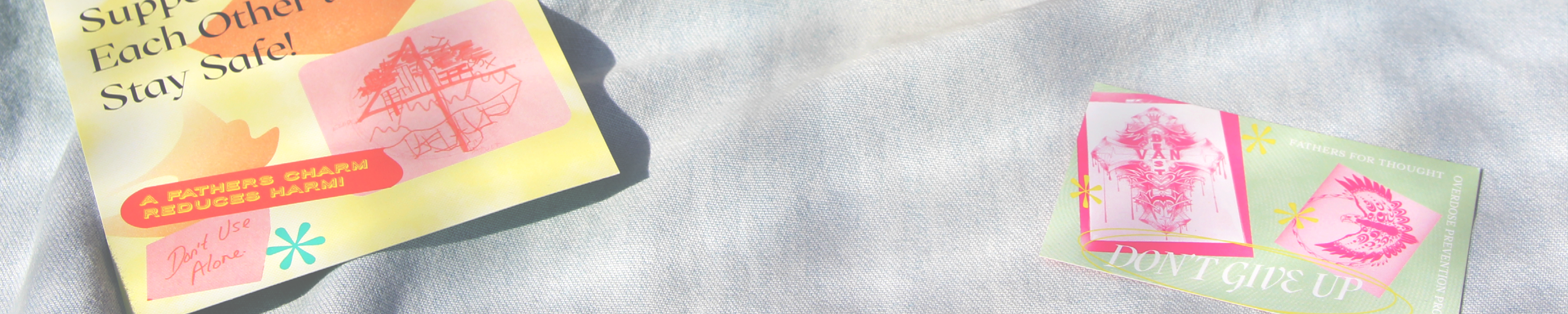
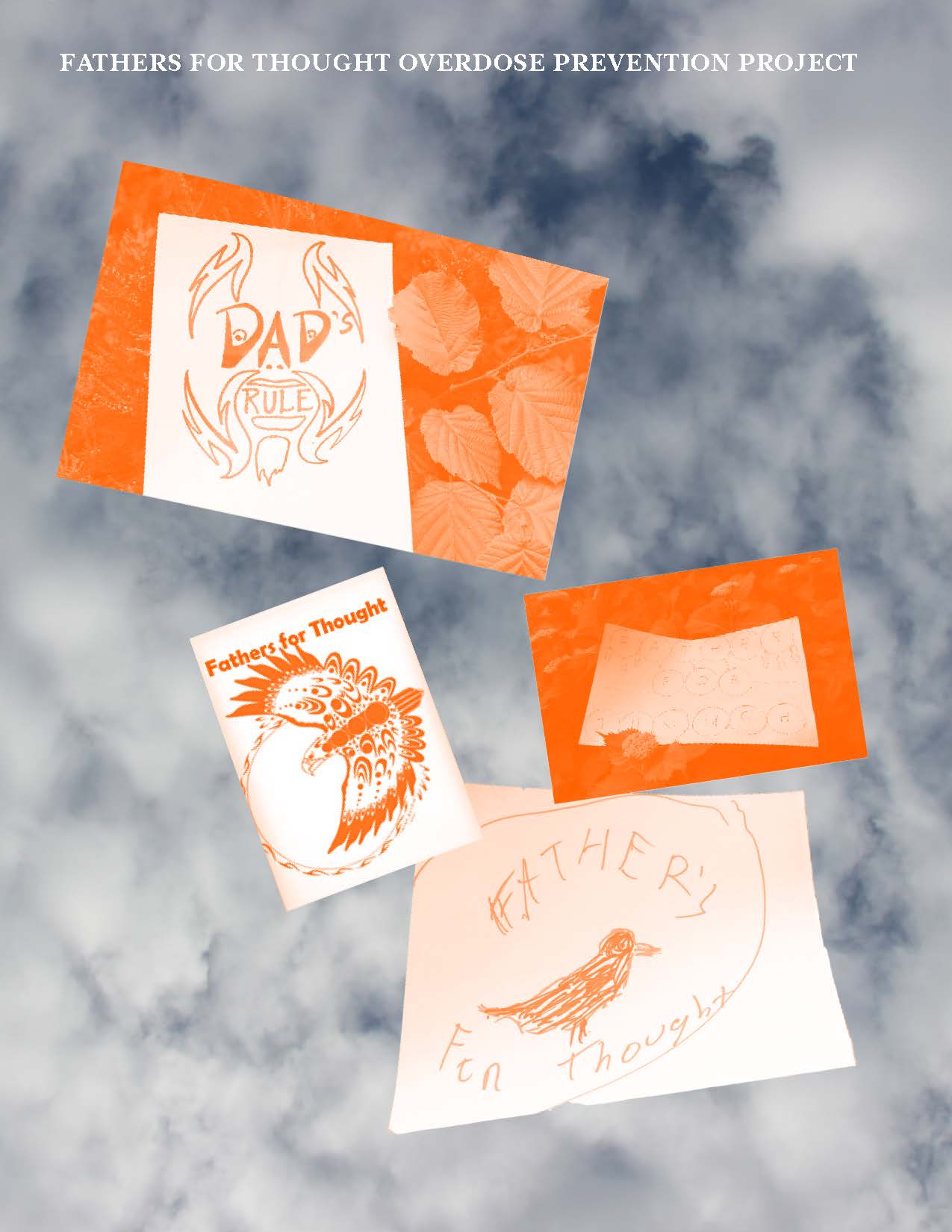
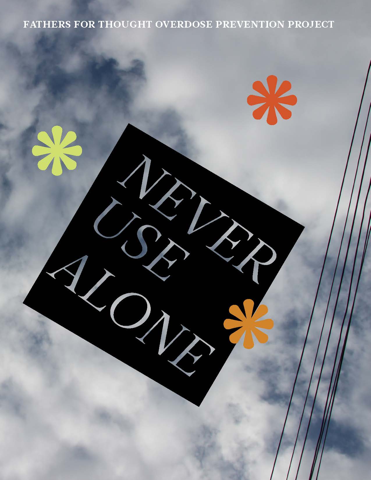
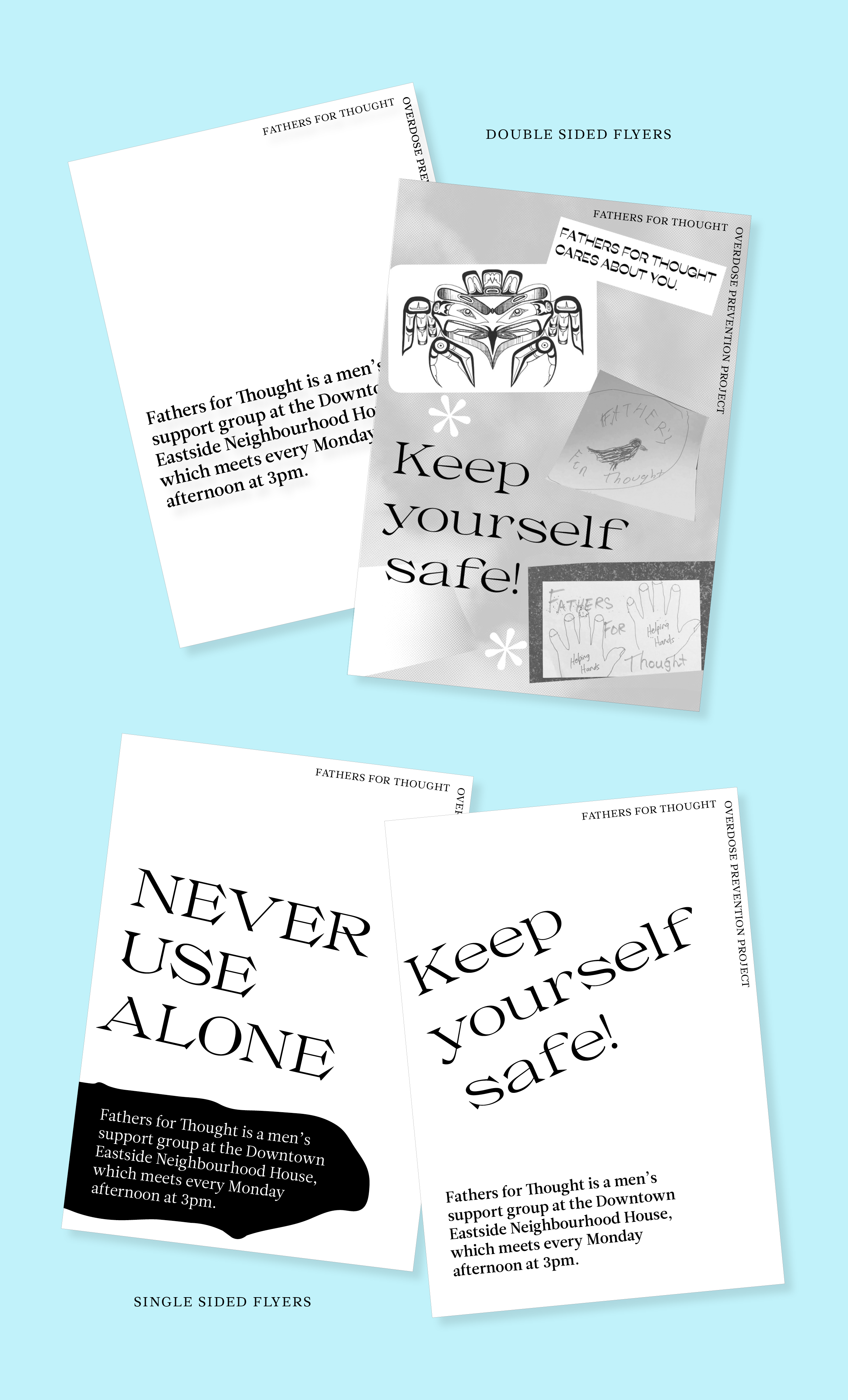
Outreach Cards
These outreach cards were designed to offer support to residents of the DTES who may not be connected to conventional institutions and services. The cards display group members’ artwork and life saving messages of support. Fathers for Thought members can give these cards to their friends and people they meet in their neighbourhood.
The goal was to make the cards brightly coloured, outrageous and decorative in hopes that they would be something that recipients would want to keep. By either putting it up a the wall in their room or carrying in their wallet, the card can act as a reminder and comfort every time they see it and read the message. I used digital collage in order to showcase the wide variety of artwork by Fathers for Thought, and made the images monotone to unify the different styles.
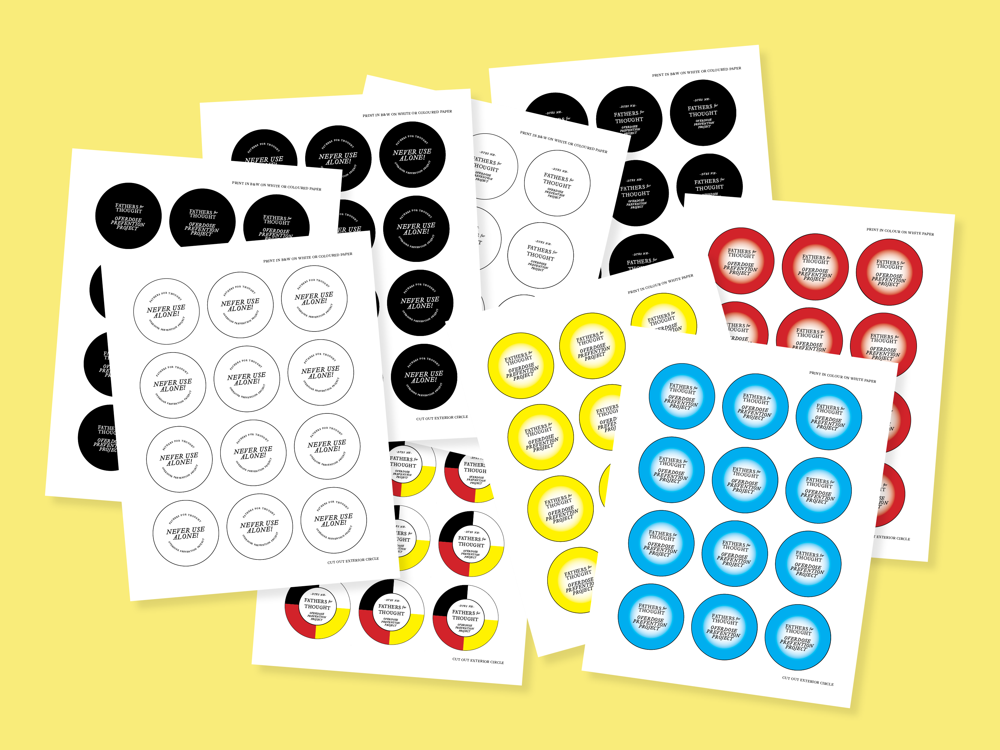
Process
Working with the group in brainstorming and feedback sessions helped to ensure that I was able to better understand their ideas and intentions for the project. During one of the later sessions it was suggested that we use colours from the Medicine Wheel for the outreach cards. I never would have thought of this, but it has meaning to a large proportion of the DTES, making it a great idea in designing for that audience. This is just one example of the value of the participatory sessions. Although it may not be instantly recognizable, I believe that applying these colours to some of the cards embeds value in the design and helps to better represent the group that I am designing for.
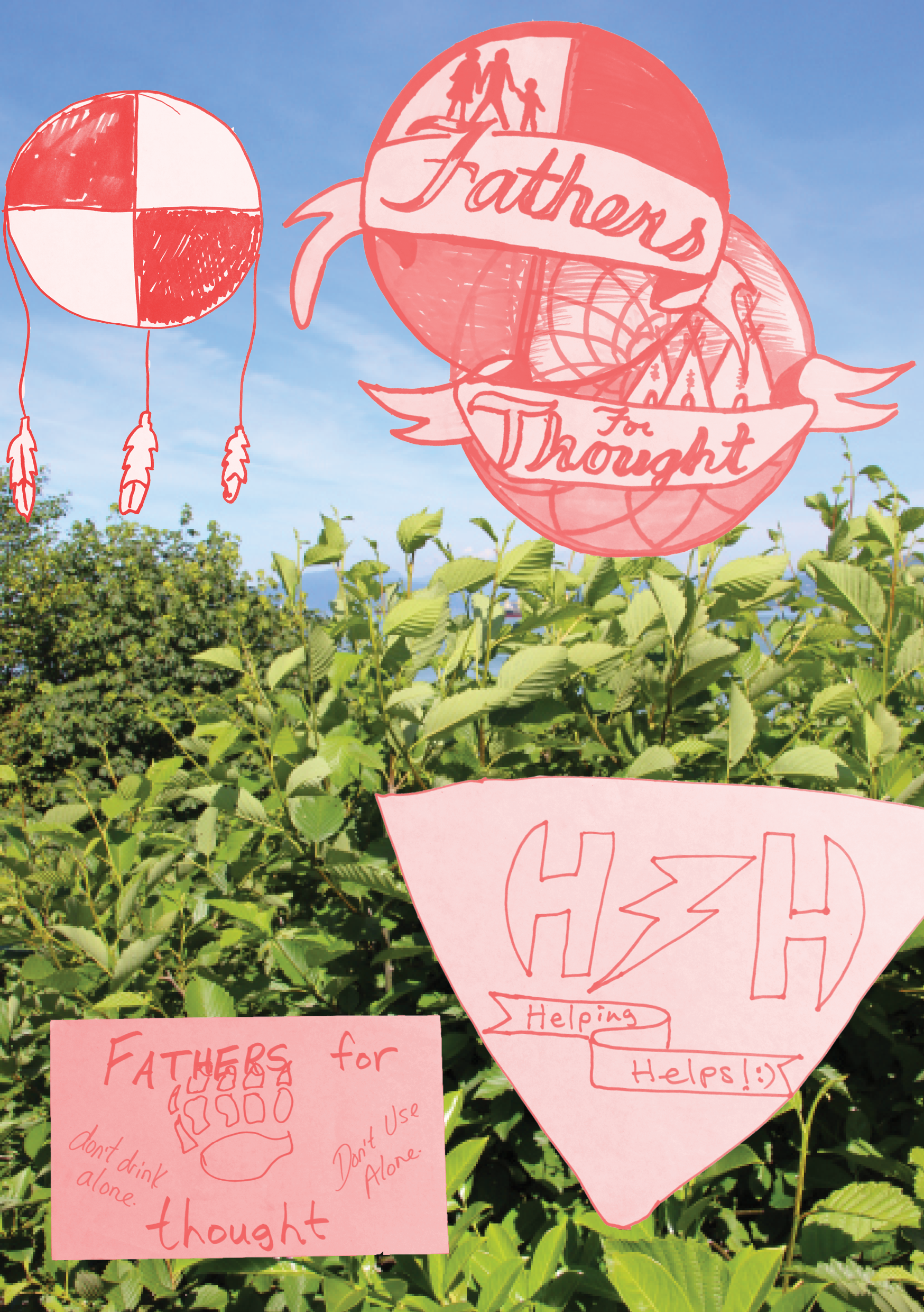


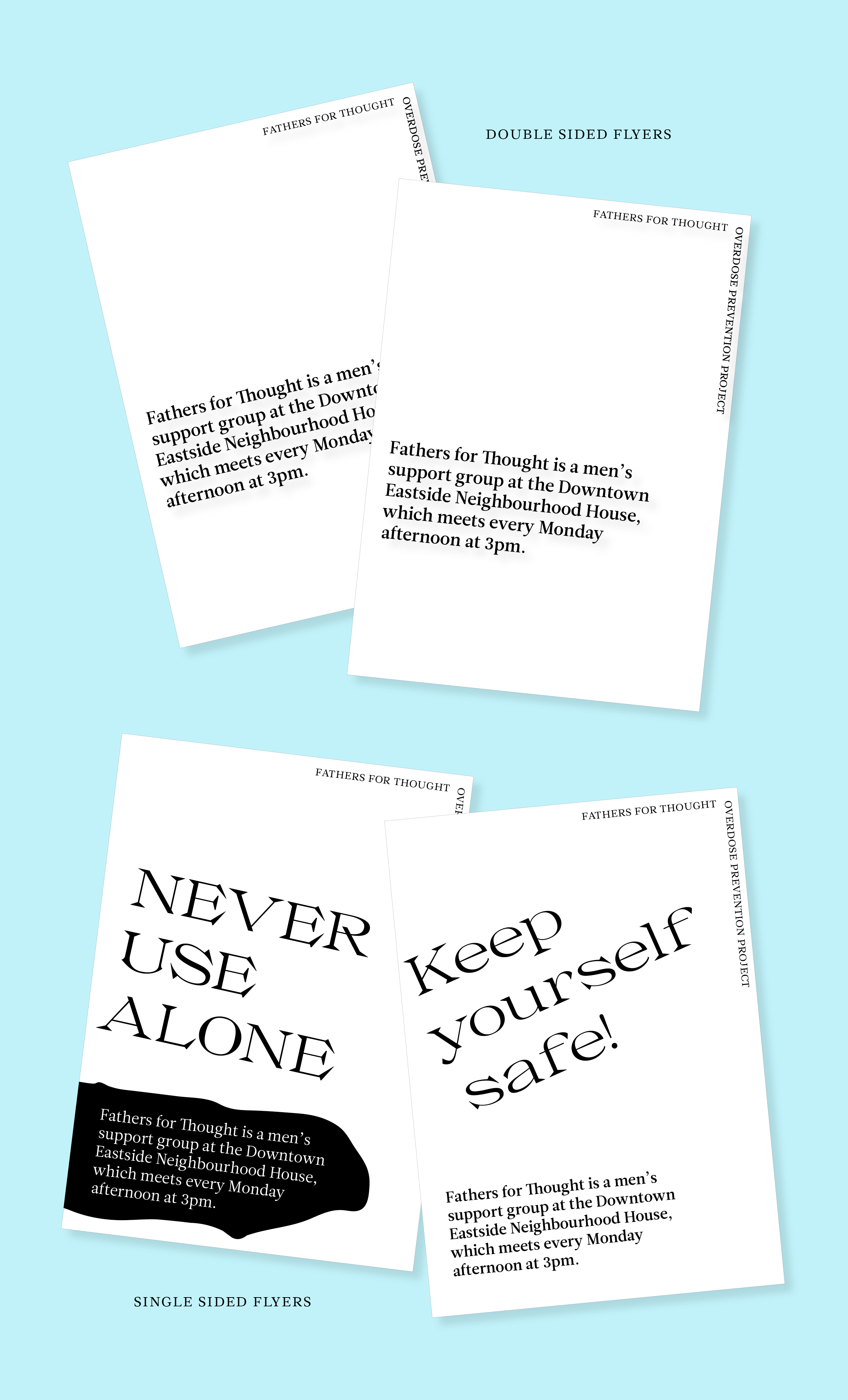
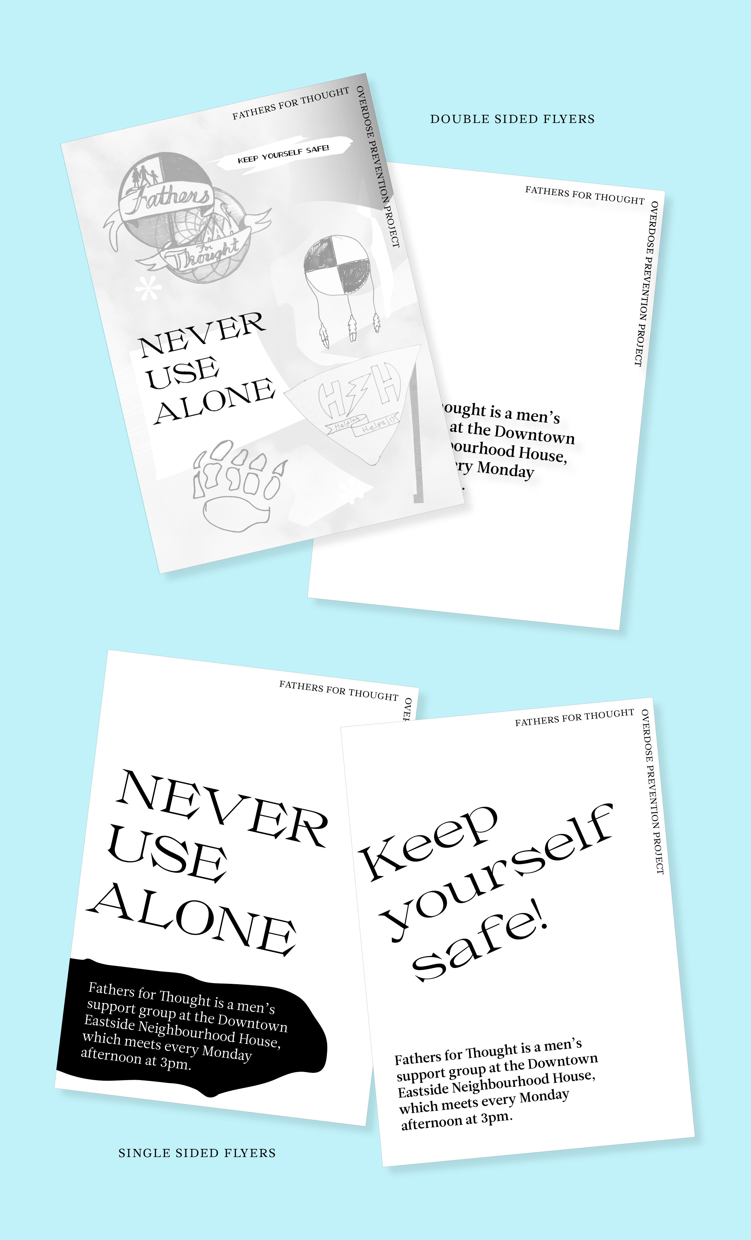

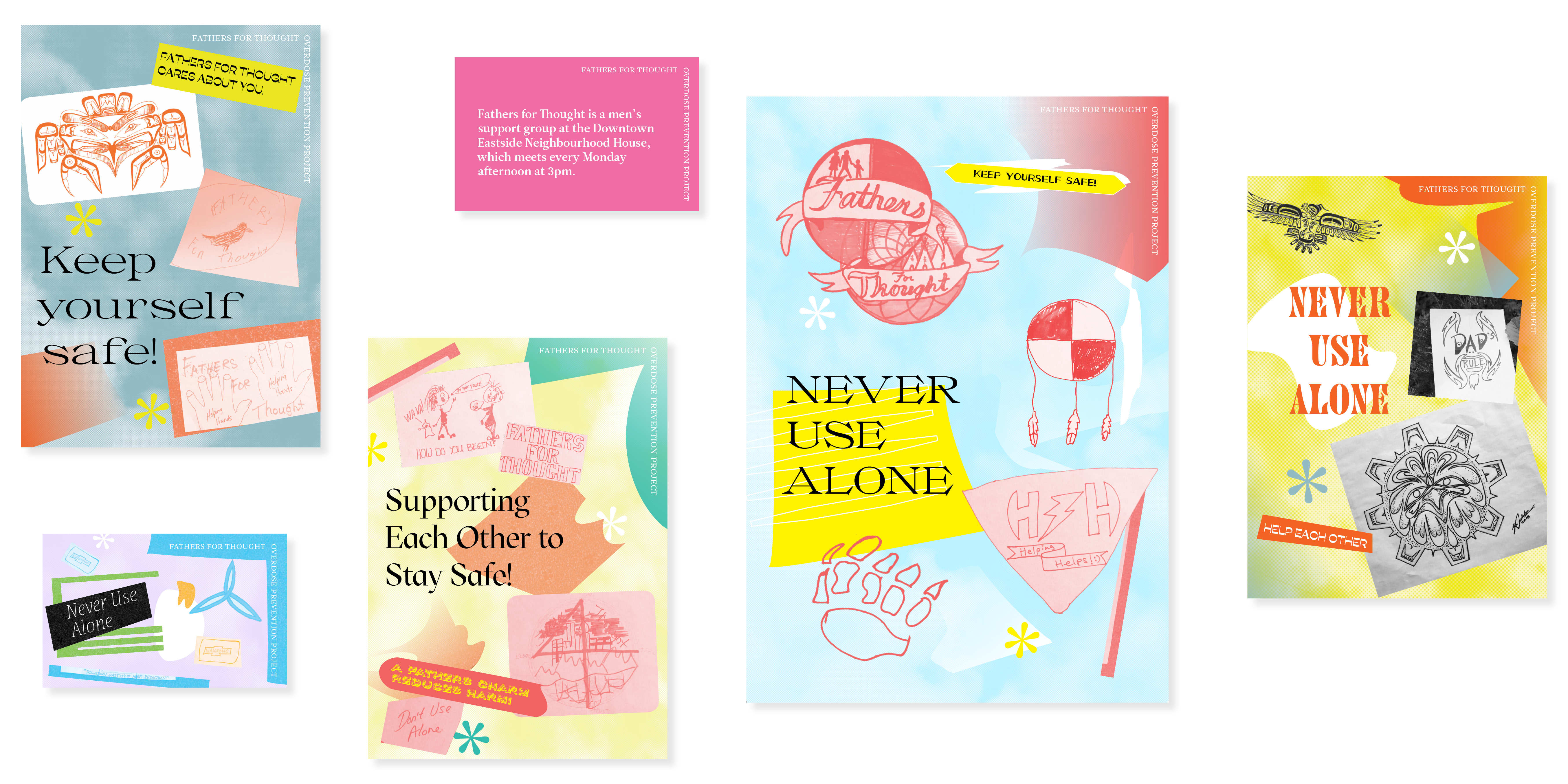
Flyers
At a brainstorming session, a Fathers for Thought member questioned the idea of spending so much money on printing these outreach cards. As they would be in colour and printed on a nice cardstock, the amount of cards produced would be limited compared to the amount that could be printed if we approached the project differently. After a discussion, we decided to create black and white designs that could be printed off 4 to a page on the Neighbourhood House printer. That way the group could also hand out these flyers whenever they want without worrying about using up the project budget. These flyers serve as a more immediate reminder and are unlikely to be kept, but they still get the message out there!

Identity
After the outreach cards were designed, the group decided to have an identity created for the Fathers for Thought Overdose Prevention Project. This was used by the group to make apparel for members, and may be used on future outreach materials.
After the outreach cards were designed, the group decided to have an identity created for the Fathers for Thought Overdose Prevention Project. This was used by the group to make apparel for members, and may be used on future outreach materials.
Wordmarks
Fathers for Thought Overdose Prevention Project is a very long name, so I chose to create two very simple wordmarks. I used different weights of Leitura News, which I had already been using on the outreach cards, making it a sort of anchor for the branding.
Fathers for Thought Overdose Prevention Project is a very long name, so I chose to create two very simple wordmarks. I used different weights of Leitura News, which I had already been using on the outreach cards, making it a sort of anchor for the branding.

 for the display type on the cards, consistency wasn’t a priority since the project did not revolve around marketing—it was all about using bold, emotive type
 while they wanted their outreach materials to be bright and bold, the guys prefer to wear simple dark t-shirts
Apparel
T-shirt and button designs were made for the group to use for their apparel. Fathers for Thought frequently screenprints their own t-shirts and has access to a button maker, so I made sure that they would be able to use the designs however they needed.
![button design print outs]() button design print-outs
button design print-outs
T-shirt and button designs were made for the group to use for their apparel. Fathers for Thought frequently screenprints their own t-shirts and has access to a button maker, so I made sure that they would be able to use the designs however they needed.
 button design print-outs